Homepage
How This Journey Works
A. Signed-In User
What this shows
- Recognizes the returning customer and restores saved order context.
- Surfaces rewards, offers, and reorder shortcuts earlier in the experience.
- Moves the customer from discovery into ordering with fewer setup steps.
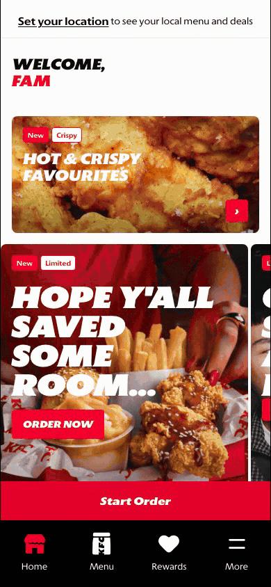
B. Guest User
What this shows
- Shows the brand, menu discovery, and starting points before account context exists.
- Lets the customer browse and build intent before sign-in is required.
- Keeps account-specific content out of view until authentication is complete.
Key difference: Signed-in users see account-aware shortcuts and rewards access. Guests can browse and build intent, but authentication is required for account-specific actions such as checkout, rewards redemption, or saved details.
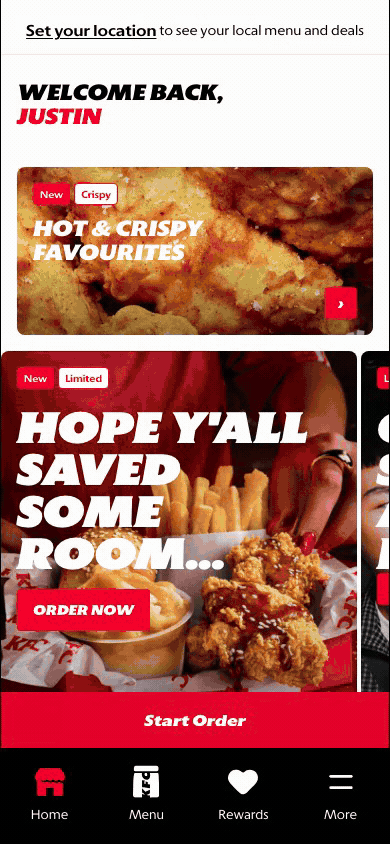
The homepage is the signed-in customer's entry point after app launch or return visit. It gives the customer a fast way to start an order, discover current promotions, review rewards, and jump back into familiar ordering behavior.
Screen Capture Sequence
The homepage should be documented as a scroll sequence because the screen combines multiple jobs: app entry, signed-in recognition, campaign discovery, rewards exposure, local merchandising, and reorder shortcuts.
State Map

Branded loading state while the app shell, fonts, customer state, and runtime data initialize.
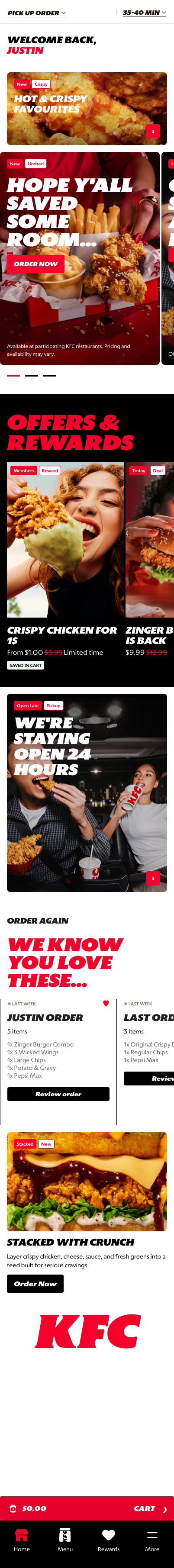
Reference for module order: context, greeting, campaign, value, local merchandising, reorder, support content, navigation.
Zoomed Detail States

Order context: makes fulfillment type and timing visible for availability, pricing, and checkout readiness.

Greeting: confirms signed-in state and makes the page feel like a returning-customer surface.
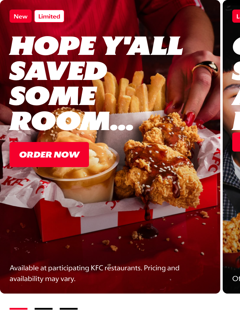
Hero campaign: creates appetite appeal and routes customers into ordering or menu browsing.
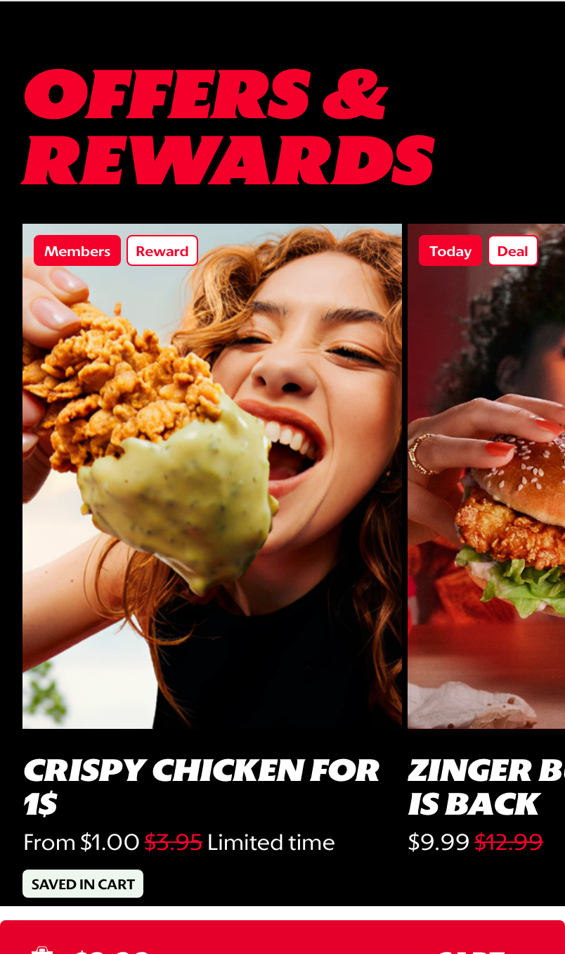
Offers & Rewards: exposes value and reward eligibility without sending customers away from Home.
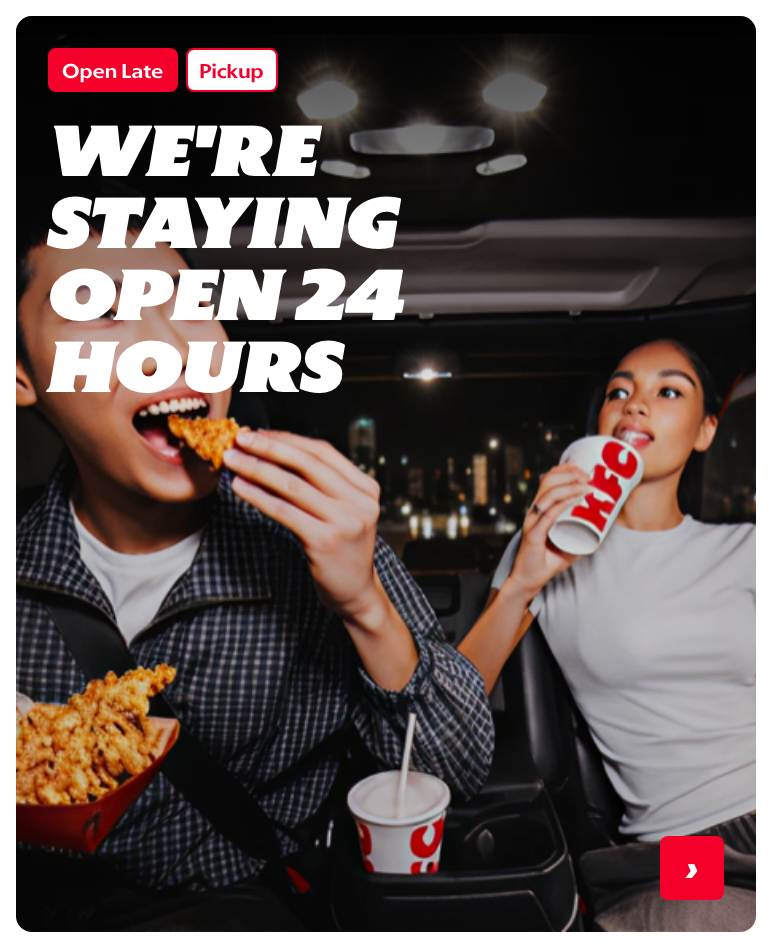
Store-led merchandising: supports local messages such as late trading, pickup, or time-of-day offers.
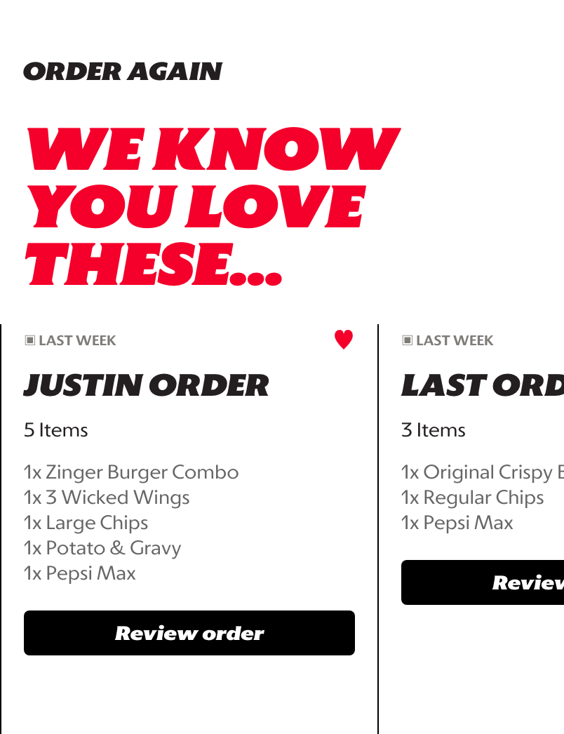
Reorder shortcuts: gives returning customers a quick path back to familiar baskets.
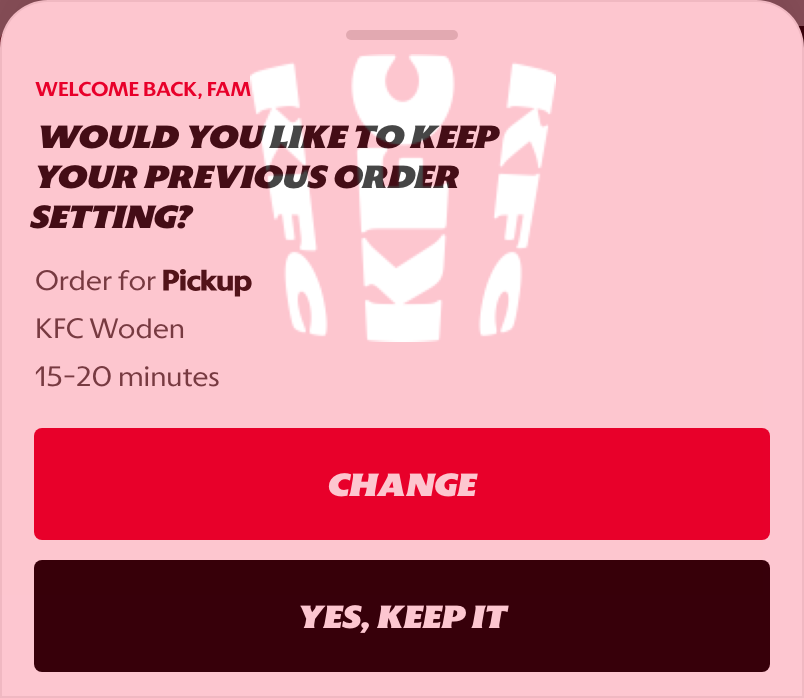
Return prompt: confirms prior fulfillment context before the customer continues ordering.
What This Feature Is
The homepage is the customer's main discovery and re-entry surface. It combines personalization, commercial messaging, rewards visibility, and quick ordering paths into one screen.
In the current prototype, the signed-in homepage includes:
- a KFC-branded splash screen before the app shell appears,
- a personalized greeting for the customer,
- an order context bar so local menu, pricing, timing, and deals can be resolved,
- promotional hero cards,
- an Offers & Rewards carousel,
- an open-hours or store-led merchandising card,
- reorder shortcuts based on previous orders,
- a returning-order prompt for customers with prior order context,
- bottom navigation into Home, Menu, Rewards, and More,
- a persistent action bar that supports
Start Orderbefore context is set and cart review once an order context exists.
Why It Is Designed This Way
The homepage is designed to reduce the effort required to decide what to do next. A returning customer may want to reorder quickly, browse the menu, check offers, or start from a current promotion. The page gives all of those paths without forcing the customer into one rigid journey.
This design also creates a stronger global commerce entry point because markets can balance brand storytelling with transactional shortcuts. The hero area creates appetite appeal, the rewards area reinforces value, and the reorder cards support speed for high-frequency customers.
WIP: What Can Be Configured On This Screen
This section should become the market configuration reference as the screen matures.
| Configurable Area | What Markets Should Be Able To Control | Current Documentation Status |
|---|---|---|
| Splash screen | Brand mark, loading treatment, and whether the splash appears for app launch or web entry | WIP |
| Order context bar | Fulfillment label, time estimate, store or address behavior, and whether context can be changed from the bar | WIP |
| Hero banners | Image, title, tag labels, CTA text, ordering, eligibility, and destination | WIP |
| Promotional tiles | Offer imagery, price messaging, campaign tags, and linked promotion | WIP |
| Carousel order | Which modules appear first and how many cards are shown | WIP |
| Signed-in greeting | Customer name logic, fallback copy, and guest-state behavior | WIP |
| Reorder module | Whether previous orders appear, how many are shown, and which actions are available | WIP |
| Return order prompt | Whether to show previous fulfillment context, what actions are offered, and when the prompt is suppressed | WIP |
| Rewards placement | Whether rewards appear on the homepage and which loyalty messages are promoted | WIP |
| Local market content | Market-specific copy, imagery, legal copy, price visibility, and offer availability | WIP |
| Visibility rules | Rules by signed-in state, market, store, fulfillment type, time of day, or campaign eligibility | WIP |
What This Screen Should Communicate
- The customer has arrived in a personalized KFC experience.
- The customer can start an order without needing to understand the full app structure first.
- Current promotions and rewards are visible early enough to influence ordering decisions.
- Returning customers have shortcuts back to familiar choices.
- Local menu and deal availability depends on location or order context.
- Prior fulfillment context should be confirmed when it could affect menu availability, timing, or store selection.
Design Read On This Screen
- The personalized greeting makes the screen feel like a returning-customer experience rather than a generic landing page.
- The order context bar sits above the merchandising content because availability, pricing, and offers depend on market and store context.
- Large hero cards prioritize appetite appeal and campaign visibility.
- The Offers & Rewards section gives value messaging a dedicated surface without turning the whole homepage into a coupon list.
- Store-led merchandising gives markets a way to promote local availability or operating context without creating a separate campaign page.
- Reorder cards support speed for repeat customers while still leaving room for discovery-led browsing.
- The return order prompt is explicit because previous settings can be useful, but customers should not be silently locked into the wrong order mode or store.
- The persistent action bar gives the customer a clear next step even while they are browsing promotional content.