Cart
How This Journey Works
A. Signed-In User
What this shows
- Shows cart review with selected items, add-ons, and order context.
- Keeps account-aware value, rewards, and checkout readiness visible.
- Allows the customer to review, edit, and continue to checkout.
B. Guest User
What this shows
- Allows guests to review the basket before sign-in.
- Keeps item edits and cart intent available before authentication.
- Introduces the account gate only when checkout readiness requires it.
Key difference: Signed-in users see account-aware shortcuts and rewards access. Guests can browse and build intent, but authentication is required for account-specific actions such as checkout, rewards redemption, or saved details.
Cart is the review step before checkout. It lets the customer validate item accuracy, quantity, customization, promos, and order value before they commit to payment.
Screen Capture Sequence
Cart should be captured from top review through add-ons and checkout summary because it is both an accuracy check and the last commercial expansion surface before checkout.
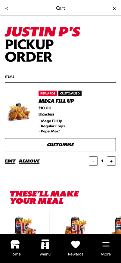
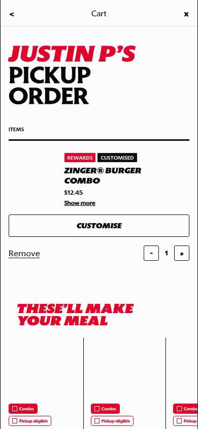
Review top: fulfillment context, configured item, edit/remove actions, and quantity controls are visible.

Add-ons: recommendations support basket growth after the confirmed item is reviewed.

Summary and checkout: taxes, totals, and checkout progression close the cart review path.
What This Feature Is
Cart is where the customer's selected items become an order. It is not only a holding area; it is the last controlled review surface before checkout.
In the current prototype, Cart includes:
- fulfillment context such as pickup order,
- configured item cards,
- item-level tags like rewards or customized,
- show-more detail expansion,
- customize, edit, remove, and quantity controls,
- add-on recommendations,
- order summary and checkout progression further down the page.
Why It Is Designed This Way
The cart needs to build trust before payment. Customers need to confirm that the right items, quantities, customizations, and fulfillment context are in place.
The design also supports commercial growth through add-ons, but the primary job is still review and correction. Edit and remove controls stay close to the item so customers can fix issues before checkout.
WIP: What Can Be Configured On This Screen
| Configurable Area | What Markets Should Be Able To Control | Current Documentation Status |
|---|---|---|
| Item card details | Product title, image, customization summary, tags, and expanded detail behavior | WIP |
| Quantity rules | Minimums, maximums, item-level quantity controls, and removal behavior | WIP |
| Edit behavior | Whether edit returns to PDP, component customization, or a simplified modifier sheet | WIP |
| Add-on recommendations | Recommendation source, product set, ordering, pricing, and eligibility | WIP |
| Rewards and promos | Coupon entry, reward redemption, promo messaging, and discount display | WIP |
| Fulfillment context | Pickup/delivery label, store/address summary, and change-order-mode entry point | WIP |
| Checkout CTA | Button label, disabled states, minimum spend handling, and checkout eligibility | WIP |
What This Screen Should Communicate
- The customer is reviewing the order before checkout.
- Item details and customizations can still be changed.
- Quantity and removal controls are available before payment.
- Add-ons are suggestions, not blockers.
- The cart is ready to move into checkout once the order is valid.
Design Read On This Screen
- The large order heading confirms fulfillment mode and customer context.
- Product cards keep customization visible enough to build trust.
- Edit and remove controls are explicit because cart mistakes are high-friction if discovered later.
- Add-on recommendations sit below the confirmed item so they support basket growth without interrupting review.
- The cart should feel operational and clear, not like another discovery page.