Checkout
How This Journey Works
A. Signed-In User
What this shows
- Shows fulfillment details, order review, promo, payment, and final submit readiness.
- Uses account context for saved details and faster payment progression.
- Keeps the final order check focused before submission.
B. Guest User
What this shows
- Shows where authentication is required before checkout can continue.
- Preserves cart intent while asking the customer to sign in or create an account.
- Makes the account gate part of checkout readiness rather than product browsing.
Key difference: Signed-in users see account-aware shortcuts and rewards access. Guests can browse and build intent, but authentication is required for account-specific actions such as checkout, rewards redemption, or saved details.
Checkout is the final validation and payment step before order placement. It brings together fulfillment details, basket review, promo or coupon handling, payment selection, and the final submit action.
Screen Capture Sequence
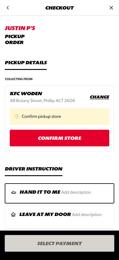
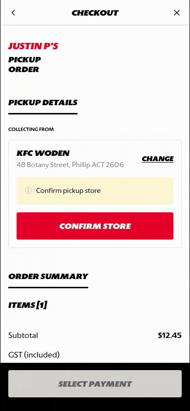
Fulfillment details: customer confirms store, timing, and handoff context.
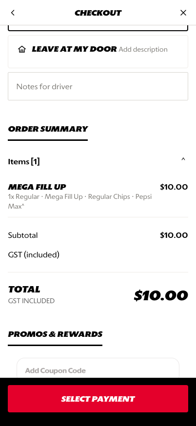
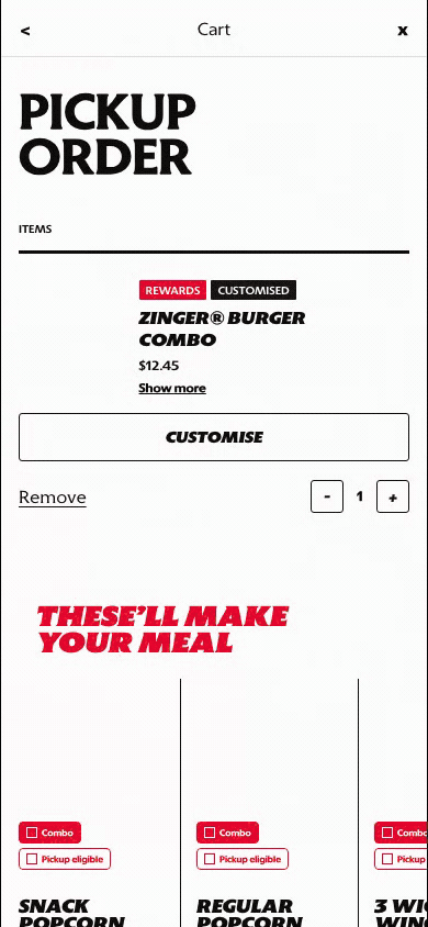
Order review: item summary and totals are visible before payment.
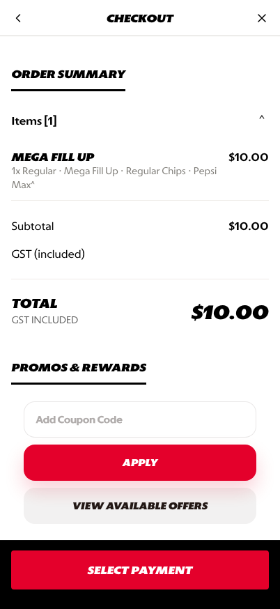
Promo, payment, and submit: coupon and payment readiness lead into the final CTA.
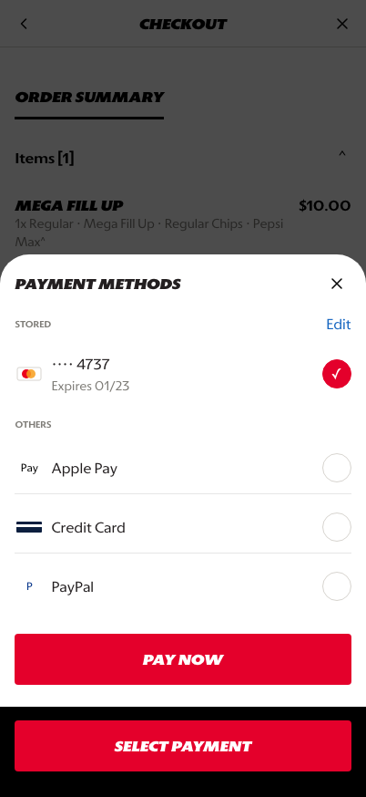
Payment sheet: stored and alternate payment methods are selected before submitting.
What This Feature Is
Checkout is the final screen where the customer confirms the order can be fulfilled and paid for. In the prototype, checkout includes:
- pickup or delivery order context
- store or address confirmation
- order item review
- subtotal, discount, tax, and total
- coupon or promo handling
- payment method selection
- final payment CTA
Why This Step Is Designed This Way
Checkout needs to minimize friction while still collecting everything required to fulfill the order correctly.
The design keeps validation and payment in one linear surface so the customer can confirm details, review the basket, apply value, and select payment without jumping between separate pages.
WIP: What Can Be Configured On This Screen
| Configurable Area | What Markets Should Be Able To Control | Current Documentation Status |
|---|---|---|
| Fulfillment details | Pickup, delivery, drive-thru, curbside, handoff notes, and store confirmation | WIP |
| Order review | Item summary, expanded modifiers, edit actions, and unavailable item handling | WIP |
| Fees and totals | Tax, delivery fee, service fee, discounts, and rounding rules | WIP |
| Promo and coupon | Coupon entry, saved offers, loyalty rewards, and basket validation | WIP |
| Payment methods | Stored card, Apple Pay, credit card, PayPal, cash, voucher, or market-specific options | WIP |
| Submit behavior | Pay now, place order, validation errors, and disabled CTA states | WIP |
| Localization | Checkout labels, legal copy, and payment terminology across supported languages | WIP |
What This Screen Should Communicate
- The customer is at the final order validation step.
- Fulfillment details must be confirmed before payment can proceed.
- Basket cost and applied discounts are visible before the final CTA.
- Payment selection is required and should feel trustworthy.
- The customer should understand what happens when they tap the final CTA.
Design Read On This Screen
- The checkout top anchors the customer in the current fulfillment mode.
- Order review keeps product confidence high before payment.
- Promo and payment sections are placed near the final CTA because they directly affect readiness to submit.
- The payment sheet uses a focused bottom-sheet pattern so payment choice does not clutter the main checkout page.
- The fixed footer keeps the final action visible while the customer reviews details.