Menu Landing / Category
How This Journey Works
A. Signed-In User
What this shows
- Shows category browsing after the customer has order context.
- Supports campaign and category discovery with localized availability.
- Keeps rewards and account-aware navigation available around the menu.
B. Guest User
What this shows
- Allows menu exploration after a basic order context is set.
- Keeps category tiles and browse paths available before account creation.
- Defers account-specific actions until checkout, rewards, or saved details are needed.
Key difference: Signed-in users see account-aware shortcuts and rewards access. Guests can browse and build intent, but authentication is required for account-specific actions such as checkout, rewards redemption, or saved details.
Menu Landing is the first structured menu surface after order context is set. It is the category gateway before the customer moves into a Product Listing Page (PLP), campaign destination, or guided builder.
Screen Capture Sequence
This page documents the category tile experience after the customer already has an order context. PLP behavior is documented separately in PLP (Product Listing Page).
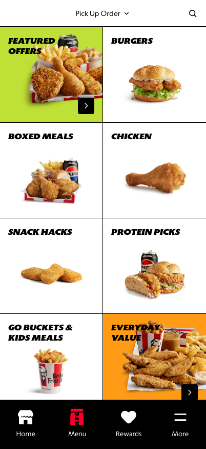
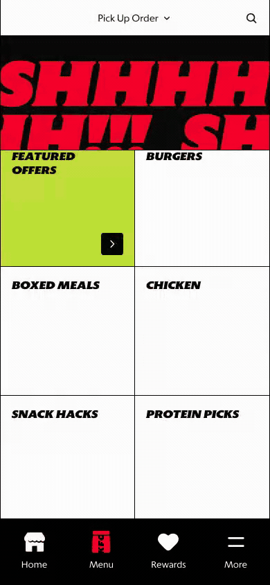
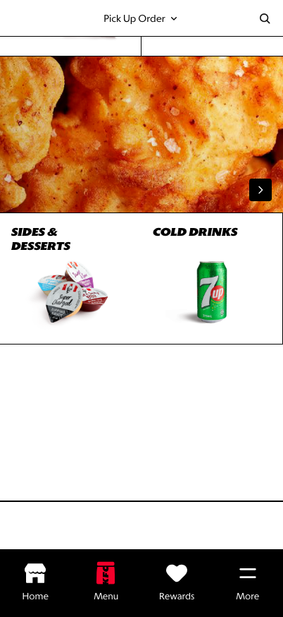
Menu landing top: once order context is set, category tiles become the primary menu entry surface.
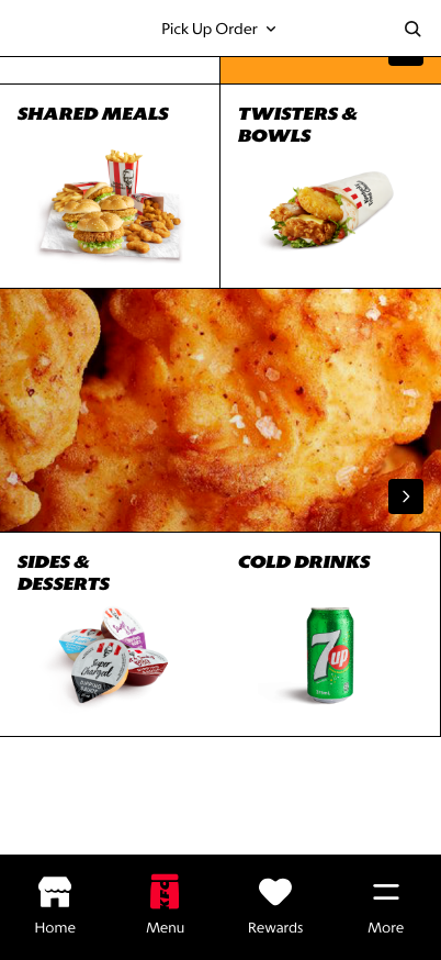
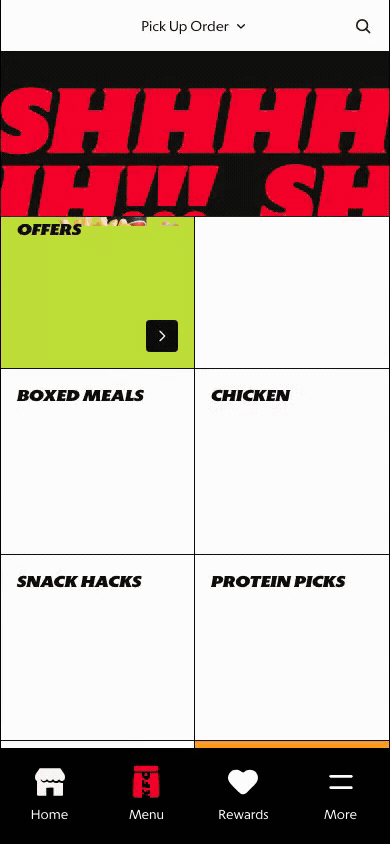
Scrolled category state: strategic categories and guided journeys remain discoverable deeper in the grid.
Lower state: footer and supporting links remain available without interrupting category browsing.
What This Feature Is
Menu Landing gives customers a clear overview of the menu structure before they start comparing individual products. The prototype uses category tiles such as Featured Offers, Burgers, Boxed Meals, Chicken, Snack Hacks, Protein Picks, Everyday Value, and Build Your Own Bucket.
In the latest prototype, the standalone start-order block is hidden once the customer already has an order context. This keeps the screen focused on browsing and avoids asking the customer to repeat a decision that has already been made.
This screen is different from a PLP:
- Menu Landing helps the customer choose a category.
- PLP helps the customer compare products inside a category.
- PDP helps the customer inspect and customize one product.
Why It Is Designed This Way
The category gateway reduces cognitive load. Instead of showing every product immediately, it gives the customer a table of contents for the menu and lets them make an intentional first choice.
This is especially useful for global markets because category strategy varies by market. Some markets need stronger value entry points, some need family meals, and others need local category naming. A controlled category surface gives markets merchandising flexibility without making the PLP noisy.
WIP: What Can Be Configured On This Screen
| Configurable Area | What Markets Should Be Able To Control | Current Documentation Status |
|---|---|---|
| Category list | Category names, order, visibility, and market-specific groupings | WIP |
| Category imagery | Tile image, crop, fallback image, and seasonal campaign creative | WIP |
| Featured category | Whether Featured Offers or another category appears first | WIP |
| Tile treatments | Accent color, wide tile behavior, and strategic category emphasis | WIP |
| Category destinations | PLP category, campaign page, Secret Menu entry, BYOB builder, or custom destination | WIP |
| Order context behavior | Whether the start-order prompt appears before order context and hides after order context is set | WIP |
| Footer links | Store apps, legal links, support links, and market footer requirements | WIP |
| Localization | Category labels and legal copy in English, French, Spanish, and German | WIP |
What This Screen Should Communicate
- The customer is entering the menu after order context has been set.
- The customer does not need to reselect order context before browsing.
- The menu is organized into clear categories.
- Category choice comes before product comparison.
- Strategic categories can be promoted without breaking scan speed.
- Secret Menu can live as a special category-adjacent entry point.
Design Read On This Screen
- The grid creates a fast visual table of contents for the menu.
- Large category labels make the screen scannable on mobile.
- Food imagery supports appetite appeal without requiring product-level detail yet.
- The category-first model creates a cleaner transition into PLP comparison.
- Hiding the start-order block after context is set keeps the page focused on menu discovery.
- This pattern gives Atlas more brand expression than a purely utilitarian list.