PLP (Product Listing Page)
How This Journey Works
A. Signed-In User
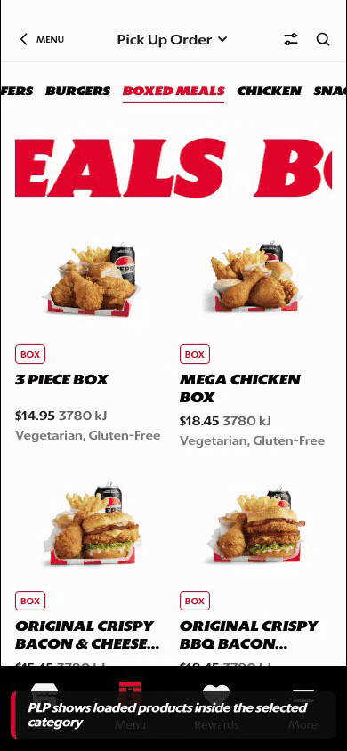
What this shows
- Shows category tabs, loaded product imagery, and product cards together.
- Lets the customer move between categories without losing order context.
- Keeps account-aware navigation available while browsing products.
B. Guest User
What this shows
- Supports product discovery and category movement before sign-in.
- Lets guests compare items, pricing, and product recognition in the grid.
- Preserves browse intent until an account-specific action is required.
Key difference: Signed-in users see account-aware shortcuts and rewards access. Guests can browse and build intent, but authentication is required for account-specific actions such as checkout, rewards redemption, or saved details.
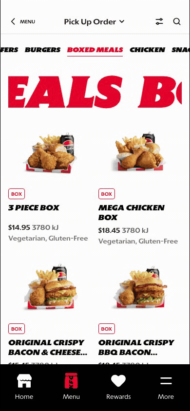
The PLP is the product comparison surface after a customer selects a menu category. It is separate from Menu Landing because the customer is no longer deciding which category to enter. They are comparing products inside an active category and deciding what to open, customize, or add.
Screen Capture Sequence
These captures show the PLP after product images have loaded. The full-scroll capture on the right documents the browse path from Featured Offers into Burgers, while the zoom crops explain the main interaction areas.
- Order context stays visible at the top so customers know whether they are browsing pickup or delivery.
- The category rail keeps the customer anchored while they move through a long product list.
- Product cards combine image, product tag, title, price, energy, and dietary attributes for fast comparison.
- The scroll continues into the next category, reducing the need to return to Menu Landing.
The PLP supports high-volume menu browsing. Customers need to compare products quickly, keep category context, and move into PDP customization without losing their place.

Full-scroll reference: Featured Offers into Burgers.

Header: keeps order context, back navigation, filter, and search within reach.

Category rail: shows the active category and supports quick switching across menu sections.
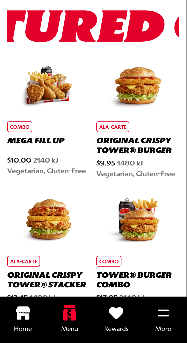
Product grid: pairs image, product tag, title, price, energy, and dietary attributes for comparison. Product descriptions are reserved for PDP.
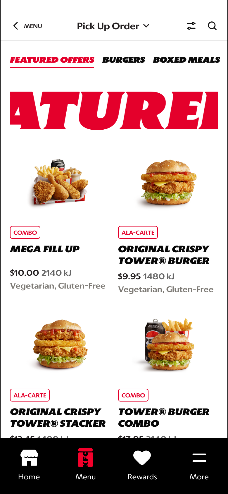
Category transition: lets customers continue browsing into the next category without returning to Menu Landing.
What This Feature Is
PLP stands for Product Listing Page. In this prototype, it shows customers a browsable set of products after they choose a category from Menu Landing or switch categories using the PLP tab rail.
The PLP should support:
- product comparison within one category
- quick category switching without losing browse context
- product recognition through loaded imagery
- clear movement into PDP customization
- continued browsing across adjacent categories
Why It Is Designed This Way
The PLP is where the customer moves from category understanding into real product comparison. It needs to feel fast, scannable, and commercially effective without turning into visual noise.
The tab rail keeps the customer anchored in the menu structure, while product cards keep the commercial decision simple: what is it, what does it look like, and what is the entry price.
WIP: What Can Be Configured On This Screen
| Configurable Area | What Markets Should Be Able To Control | Current Documentation Status |
|---|---|---|
| Category tabs | Category order, labels, active default, and visibility | WIP |
| Product cards | Product title, image, price, product tags, calories or nutrition metadata, and dietary attributes | WIP |
| Product sorting | Default sort, category order, featured placement, and availability handling | WIP |
| Promotion treatment | Value labels, limited-time badges, campaign placement, and offer eligibility | WIP |
| Image fallback | Fallback assets when product images are missing or slow to load | WIP |
| Out-of-stock state | Disabled cards, substitution logic, and messaging | WIP |
| Localization | Category and product text in English, French, Spanish, and German | WIP |
What This Screen Should Usually Communicate
- The customer is inside a specific category.
- The category can be changed quickly through top-level tab navigation.
- Products are arranged for comparison, not deep storytelling.
- The page should help customers move toward PDP, customization, or basket-building with minimal friction.
Design Read On This Screen
- The top category bar keeps the customer anchored inside browse while still making cross-category switching fast.
- The product grid gives strong visual comparison without forcing the user into one-card-at-a-time browsing.
- The red active tab treatment makes the current category state easy to understand at a glance.
- Product cards are built around the commercial essentials first: image, product tag, title, price, energy, and dietary attributes. Product descriptions belong on PDP, not PLP.
- The customer can scroll into additional category sections, which supports broad menu discovery without forcing a reset back to the category tile page.